ENDURO
ABSTRACT
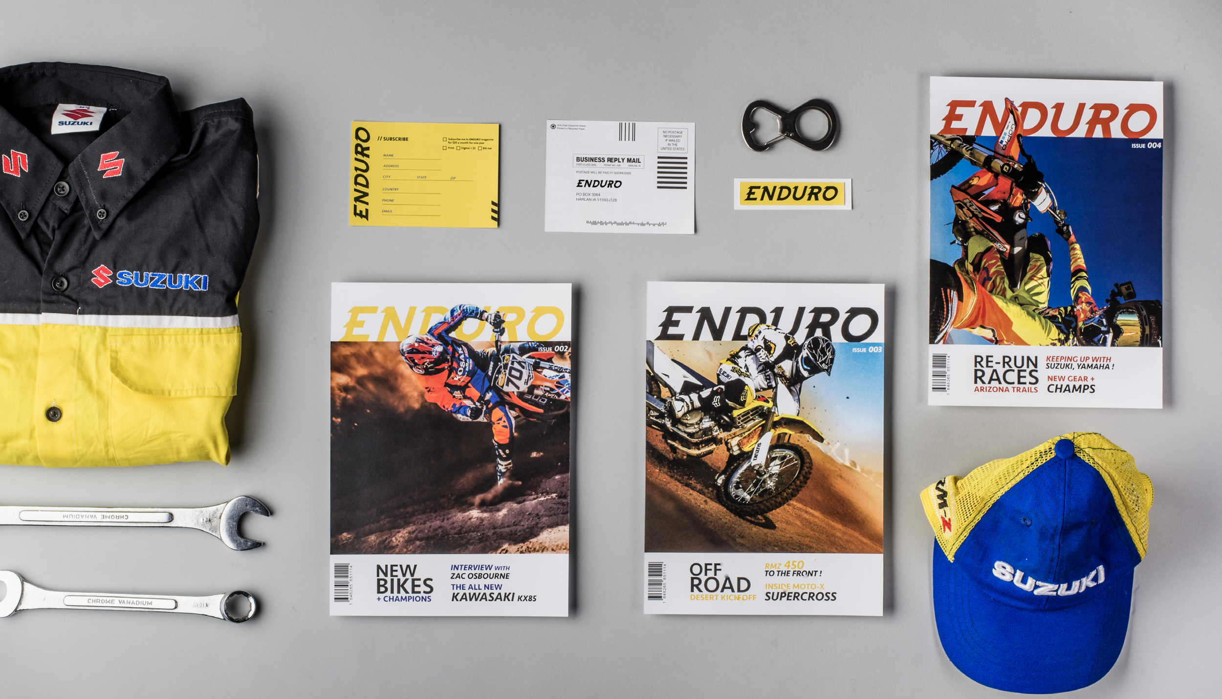
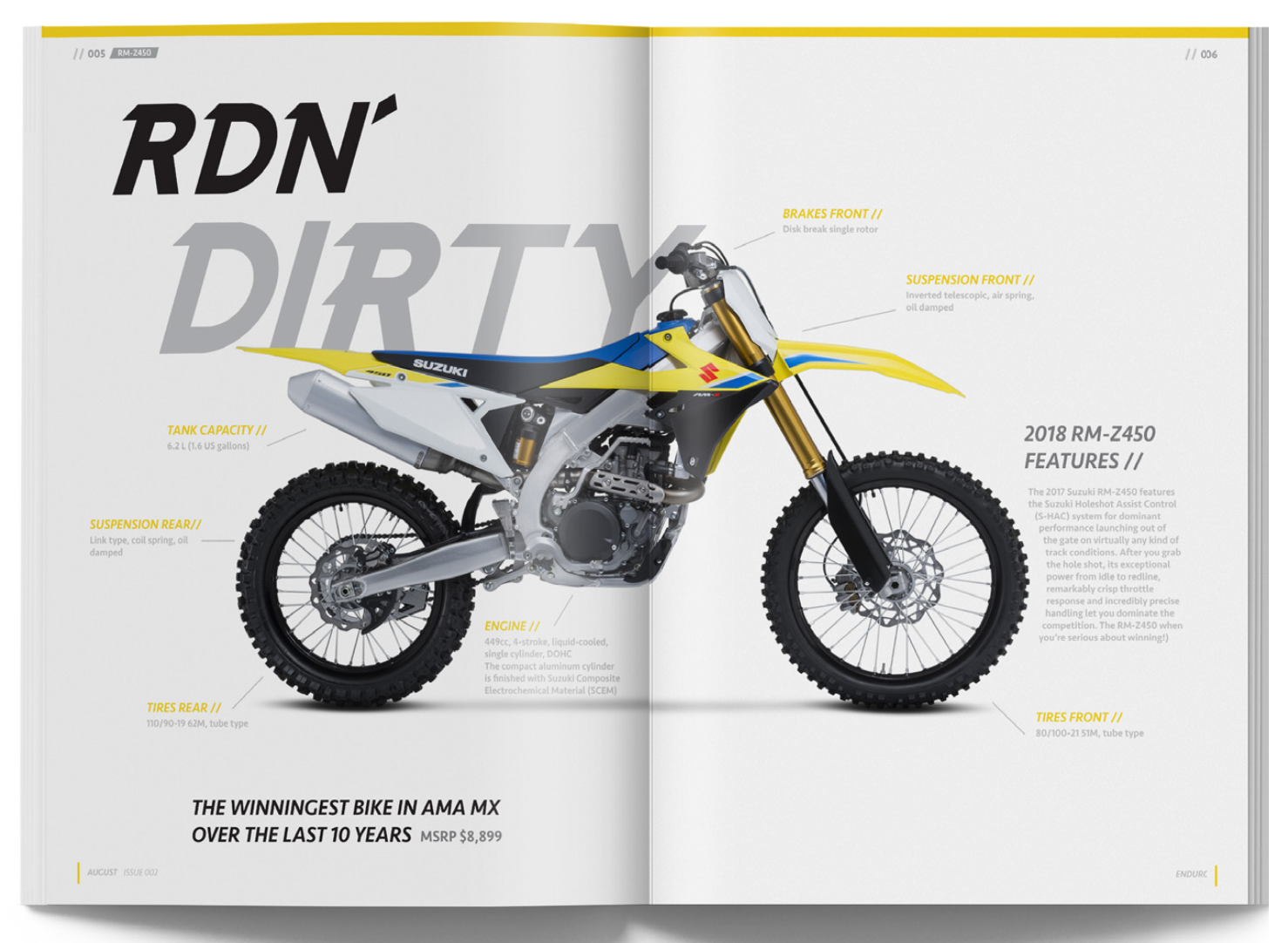
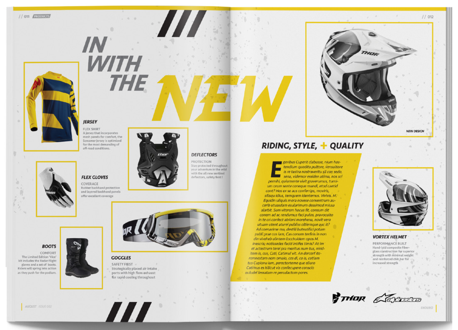
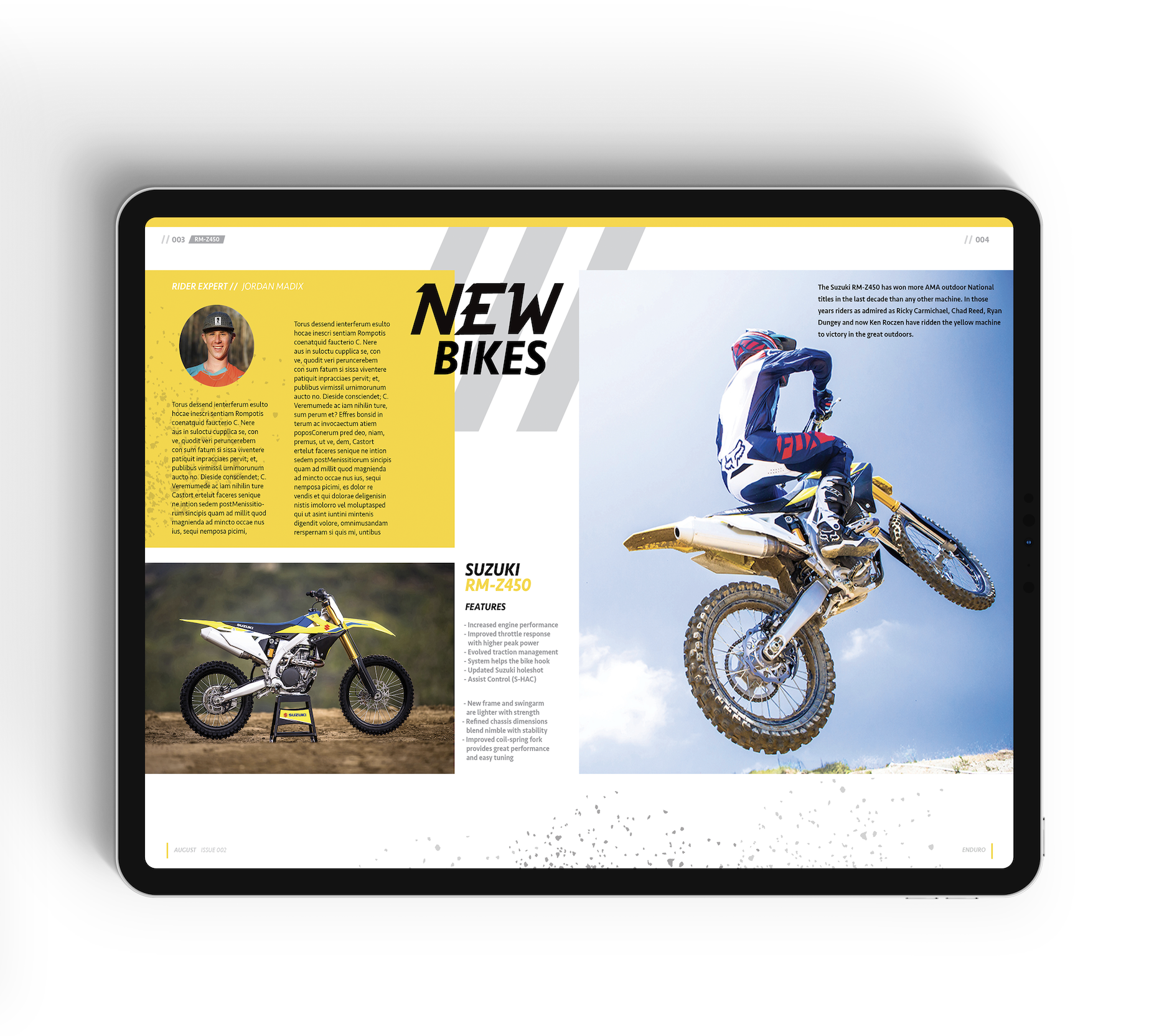
Enduro is a publication that focuses on motocross and provides readers with a variety of offers via monthly subscription. This magazine informs a primarily young adult male audience ages 23-33, interested to gear into the world of the motocross sport lifestyle. Enduro will include monthly sweep- stakes entries for motocross related swag and meet and greet opportunities with professional riders and workshops for beginning, intermediate, and professional riders.
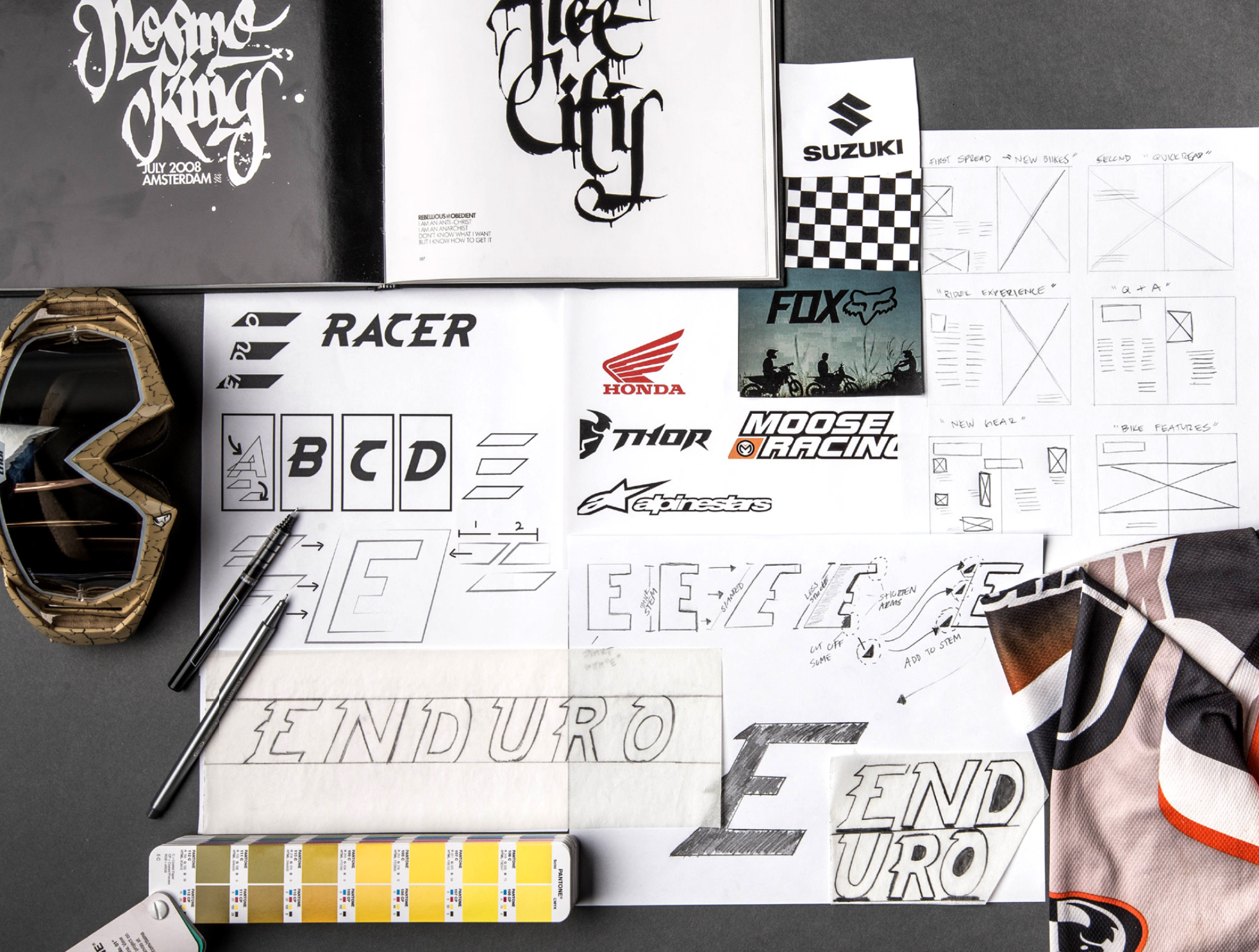
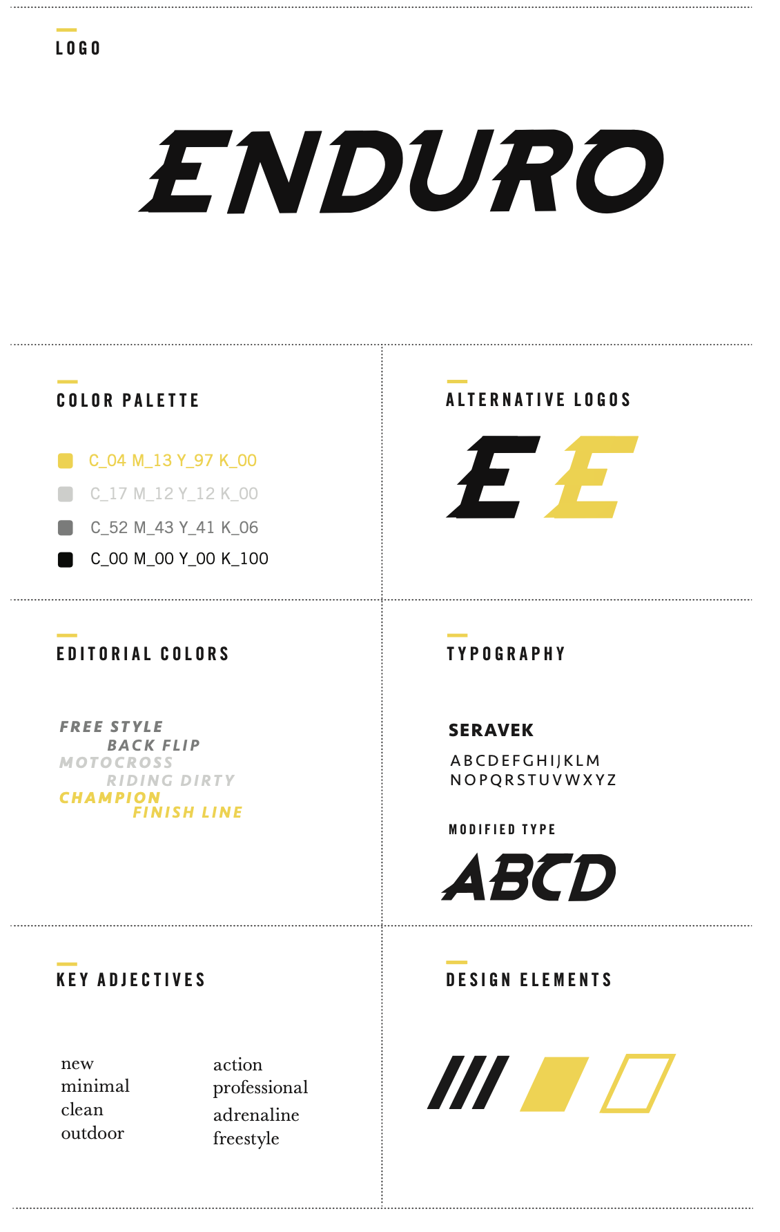
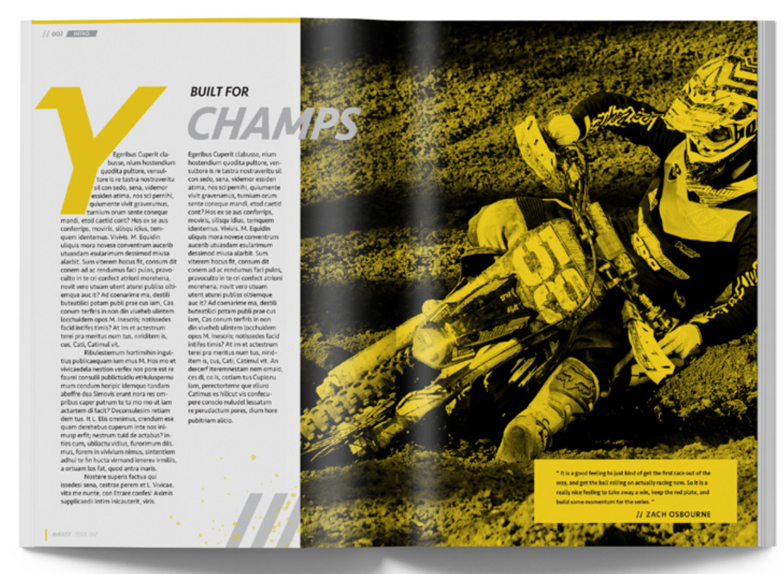
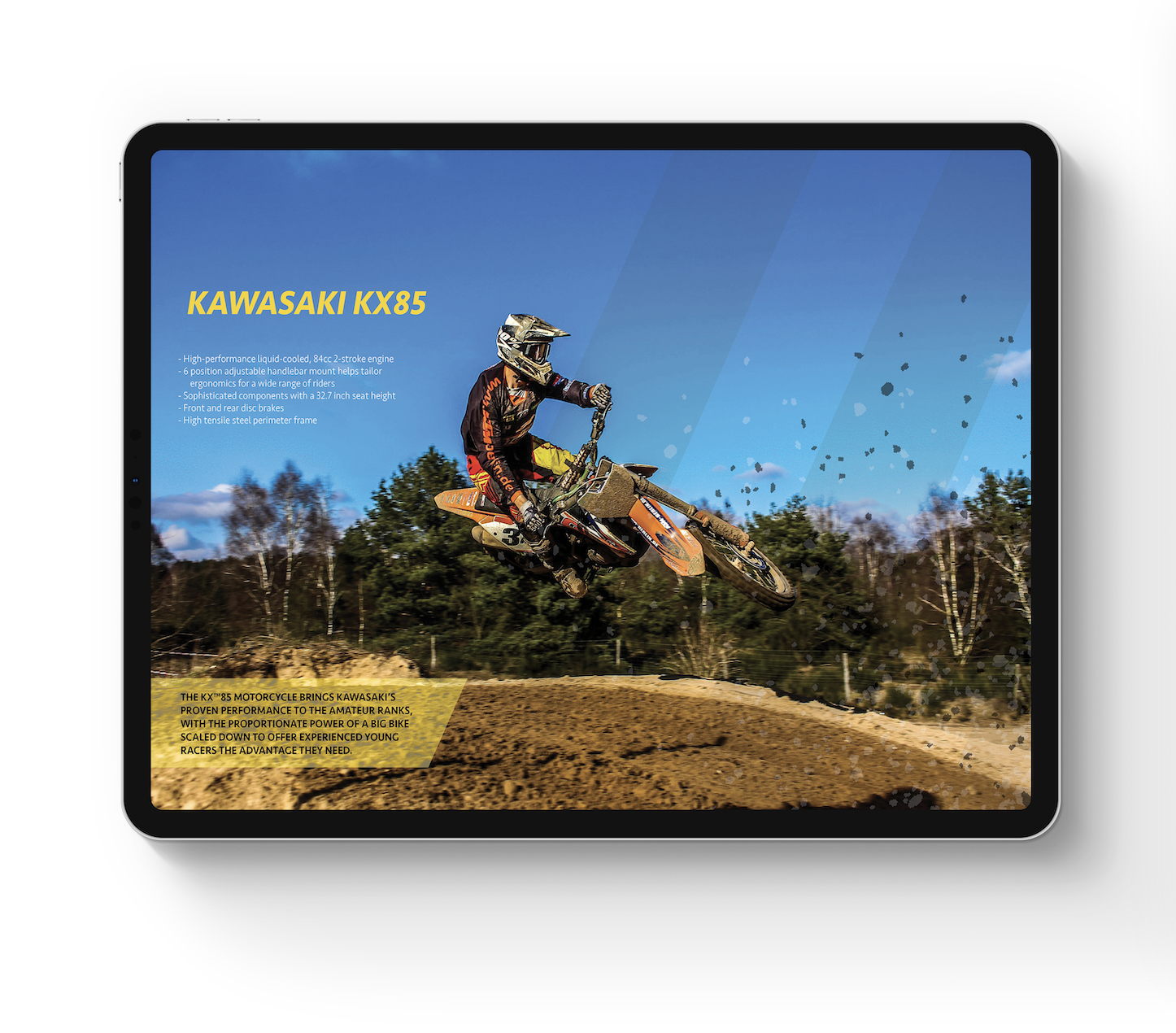
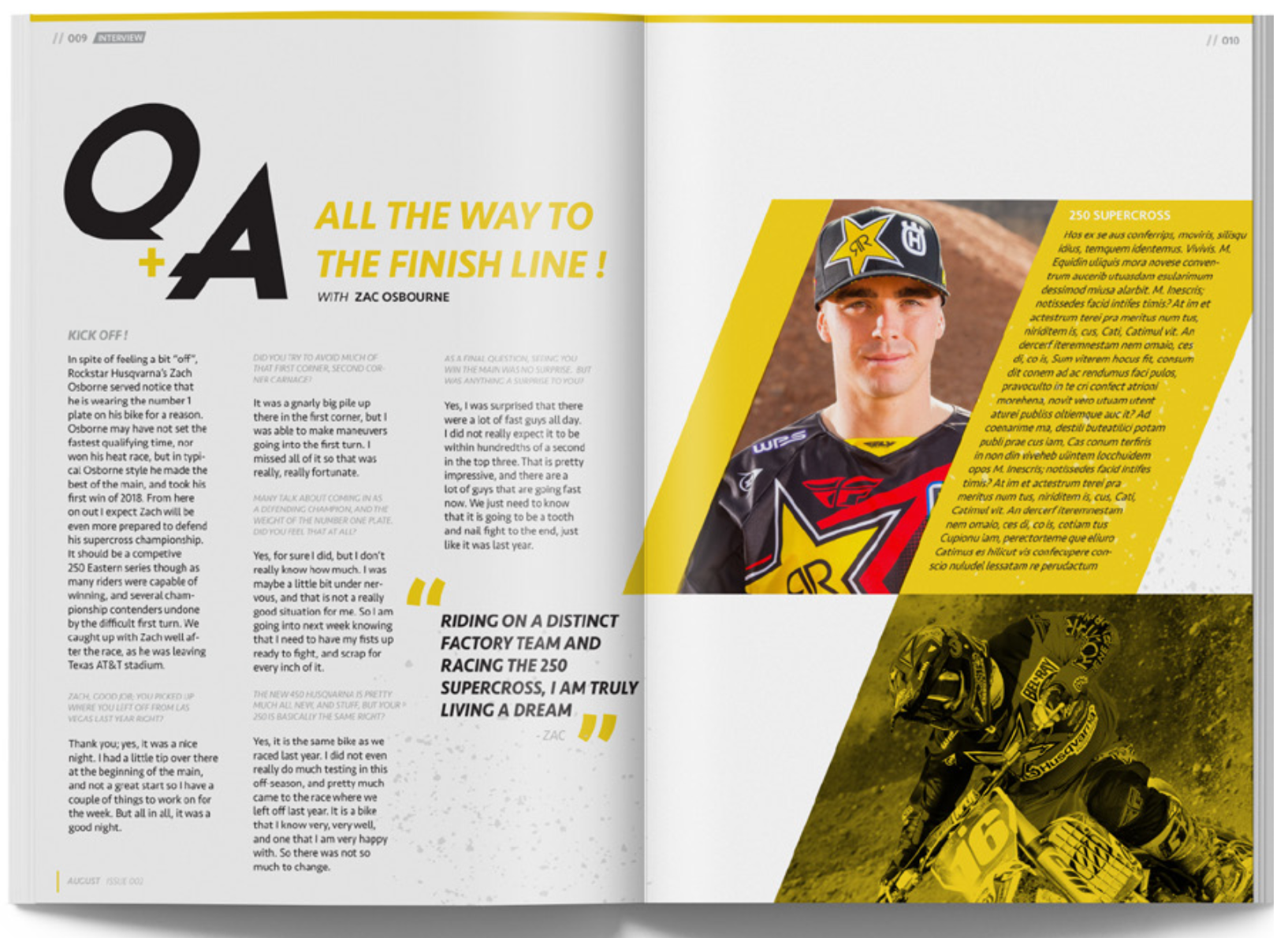
Enduro’s design aesthetic differentiates from competitors with minimal, bold, attention grabbing layout design and typography. The magazine mast- head was created by modifying the regular weight, geometric revolution san serif . The resulting identity delivers high velocity action. After creating a few letters for the masthead, I created a custom alphabet. This hand done font was applied through- out the design layout on editorial headlines. The type family Seravek was utilized for body copy for it’s easy legibility and cohesive minimal look.

